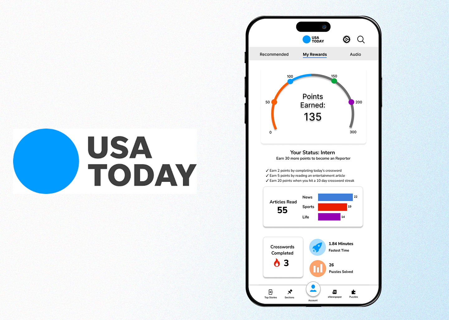
Header image depicting USA Today logo and a screen of the redesigned app.

USA Today: A User Retention Strategy

Developing a product strategy and design for rewards and AI features.

Role Duration Project Type Tools/Skills
UX Researcher and UI Designer 4 Months Partnership Product Management, Competitive
Analysis, Figma, Qualtrics Surveys

Summary

I was tasked with developing a product strategy to boost user retention on Gannett's USA Today App. Gannett's customer experience team outlined a major issue with the product's user retention: only 2% of users were signing in when accessing the app. To address this issue, I completed competitive analyses, design thinking workshops, and conducted a user research study to ideate solutions. I developed a rewards system with a projected 12% increase in user retention, then presented this solution to the Gannett customer experience team.
Overview

Problem: Gannett reported that only 2% of users were signing in when visiting USA Today's app.

Objective: Develop a strategy to promote user retention through additional incentives and functionality.

Research and Process:

  • Conduct extensive competitive analysis to outline possible solutions.
  • Outline target audience (personas) and extensive survey on target audience to outline general user needs.
  • After developing an initial prototype, conduct user testing to gather insights and feedback on features.
  • Integrate user research data to update product and present final design to the Gannett customer experience team.
Outcome: Presented business strategy, research findings, and high-fidelity fully interactive product prototype to Gannett's customer experience team.


Reflection

In partnership with Gannett (USA Today), I built a product strategy to address low user retention using several key business analysis methods.

  • Competitive Analysis: Building a strong, competitive product means being aware of current trends and strategies. Throughout this project, I analyzed several other publication websites, like the New York Times, Washington Post, or even local sites like WRAL to determine how other sites were keeping users engaged. Not only does competitive analysis help generate ideas, but it allows me as the product manager to take my product a step above the competition by building on possible gaps in existing products.

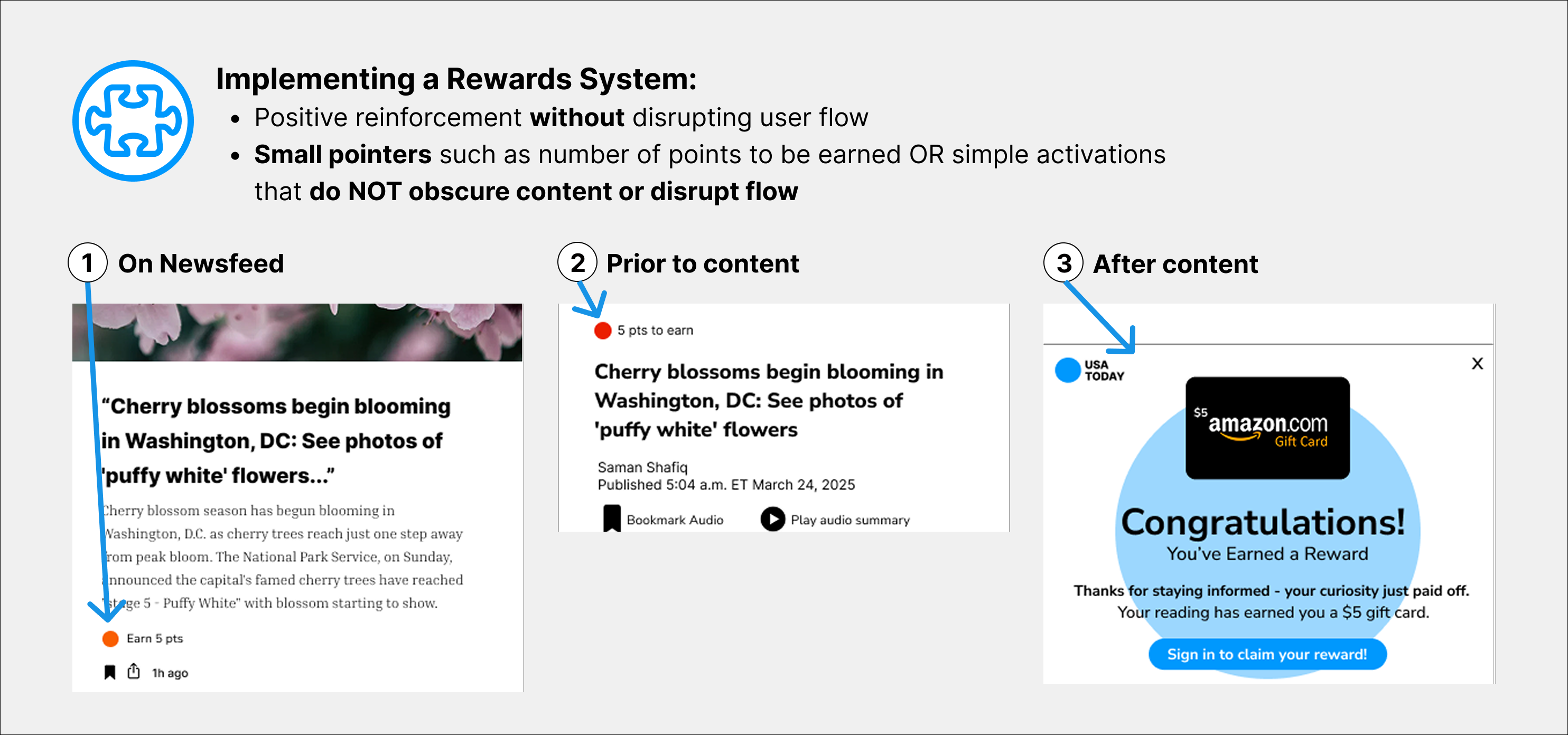
  • Gamification: Gamification means that users are rewarded for interaction with a product. In this case, reading articles or listening to podcasts within the app. I learned to maintain a balance between rewarding and annoying the user: rewards had to be a bonus feature, not distracting or bothersome. This was done by subtly including updates on how many points a user was earning by completing an action. For instance, before and after each article, there was an indicator to the user how many points they earned.


Initial Evaluation

I analyzed the current iteration of the app to identify possible areas of improvement regarding user motivation. I observed the following trends:

  • Unclear sign-up incentive: The current app did not make a clear effort to incentivize a user to create an account. Without any clear benefits to creating an account, users did not find it necessary to sign up.
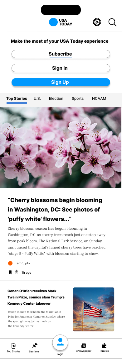
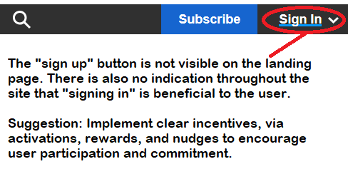
  • Too many conflicting options: The current iteration has "sign up", "sign in", and "subscribe" options. The visual emphasis is on the subscribe button instead of the sign up button. This means that users may miss the option to create an account.
An arrow pointing to the visually distinguished subscribe button (no sign up button is visible).


Personas

According to domain research, the target audience for the website tends to be professionals, more than half of respondents reported receiving their daily news from a mobile phone app. Some users also reported they did so while multitasking. Generally, respondents were reluctant to register for online services due to concerns surrounding spam and privacy.

Research Question: How might we encourage working professionals (25-40) to authenticate on each visit to the app?

Participants Age Groups Method
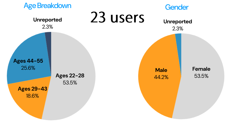
43 people 53.5% 22-28, 18.6% 29-43, 25.6% 44-55, 2.3% Unreported User Interview and Qualtrics Survey
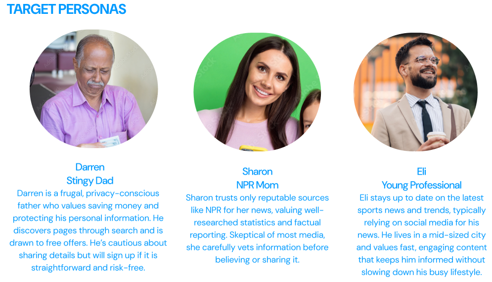
Three personas are pictured, each with a written description.
Two pie charts breakdown the percentages of the respondents. First chart: Age breakdown, ages 22-28 = 53.5%, ages 29-43 = 18.6%, ages 44-55 = 25.6%. Second chart: Gender, female = 53.5%, male = 44.2%.

Survey Results:

  • 67% of users reported being more likely to trust promotional offers from recognizable brand names
  • 55% of users receive news from a phone app.
  • Users were concerned about spam (48%), legitimacy of an offer (27%), and privacy (23%).
  • Users thought they may be encouraged to sign up by giftcards (44%), a $5 coupon for a local business (23%), and branding gear (20%).


Personalization

As part of a strategic initiative to drive account creation, I designed and prototyped multiple personalization features based on comprehensive competitive analysis. These features were intended to enhance user engagement and improve the overall experience from the moment an account is created.

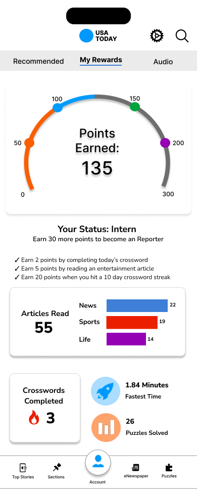
  • Gamified Rewards: Users can earn points through various forms of engagement, including reading articles, completing crosswords, and listening to podcasts. This incentivizes continuous interaction, fosters user retention, and drives ongoing engagement with the platform.

  • Personalized Recommendations: Upon account creation, user interests across various topics are tracked, enabling the delivery of a tailored news feed that aligns with individual preferences. This ensures a more relevant and engaging experience right from the start.

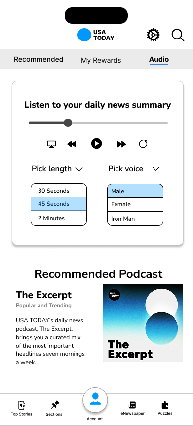
  • Audio Engagement: Recognizing the diverse preferences of users, I implemented features that extend beyond traditional reading. Using AI-driven technology, articles are summarized and read aloud or included in a news summary podcast. This not only enhances the user experience but also addresses accessibility needs, ensuring the platform is inclusive and usable for all.


Focus: Digital Rewards System

I was the digital rewards system lead. I decided to focus on this feature since I noticed that many competitors had successfully implemented this feature and greatly boosted user retention.

Goal: Leverage digital rewards to encourage users to create accounts and remain active users.

When developing the rewards system, I ensured that users would be aware but not annoyed by the system. All activations or "pointers" were minimally invasive and instead aimed to catch a users attention. For instance, I used a bright dot to indicate potential points available. I also included "Calls To Action (CTAs)" on the news feed, before an article, and after an article. Calls to action encourage users to sign in to access exclusive rewards and experiences. Here's how it works:

A screenshot of an article highlighing points in the design where 'rewards' are highlighted.
Steps highlighting rewards strategy: 1. earn points via engagement,
                            2. rewarding habit formation, 3. leveling up tiers via perks, 4. local community connection via rewards in partnership with local businesses.

Takeaway: Rewards incentivize commitment from new users, they can earn and redeem points for gift cards, merchandise, and more.


Focus: Activations

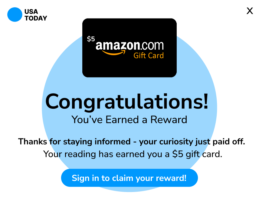
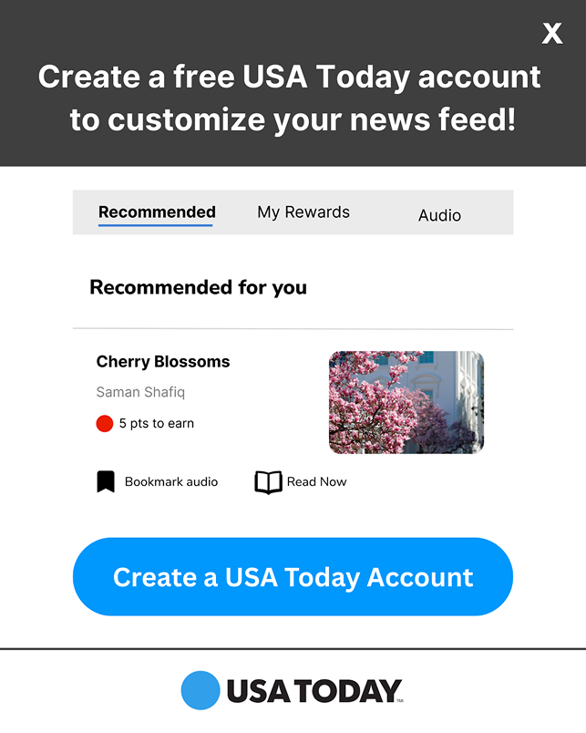
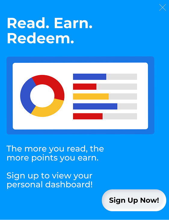
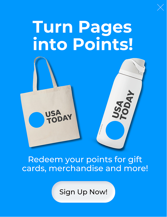
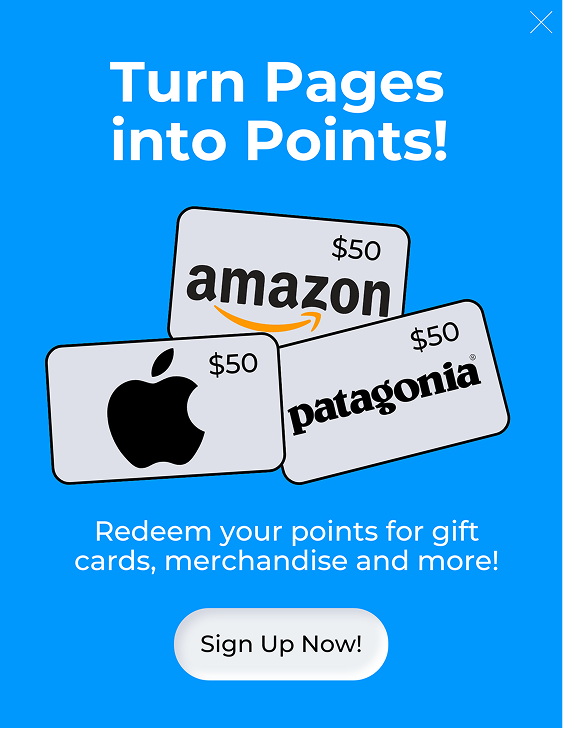
Additionally, I designed and implemented a series of targeted activation campaigns (ads) aimed at reminding users to sign in and access their rewards. When implementing them, My primary concern was making sure that they did NOT disrupt the user flow by having the ads placed strategically throughout articles. Each ad also focused on clearly communicating which rewards a user could earn.

Ad reading 'congratulations, you earned a reward', showing a gift card.
Ad encouraging user to sign up to customize their news feed.
Ad reading 'read, earn, redeem'.
Ad reading 'turn pages into points' with images of potential rewards.
Ad reading 'turn pages into points' with images of potential gift card rewards.

Final Prototype

The final prototype focused on integrating the rewards system, recommendations, and AI features within the authenticated (signed in) user experience. User testing indicated users enjoyed the rewards features:

84% reported earning points as their favorite feature.
64% found rewards somewhat to highly motivating.

Redesigned USA Today app landing page, the sign up button is highlighted.
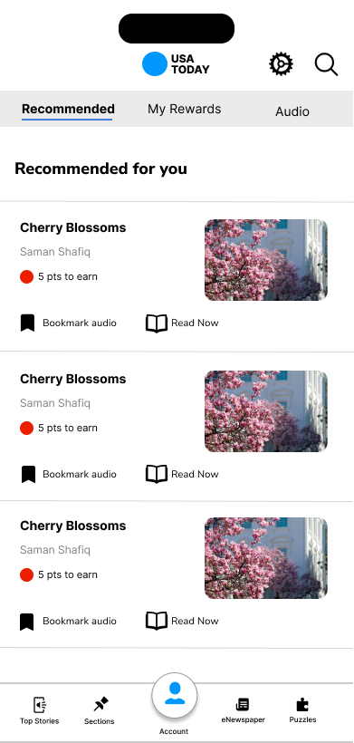
Recommended page, shows articles and potential points to be earned.
Article page with potential points at the top.
Rewards dashboard page, has a graph tracking points earned.
Audio page, users can play a daily news summary podcast.


Next Steps

Both users and the Gannett team responded positively to the product and presentation. Following the presentation, I would definitely like to explore AI features, like AI summaries and personalized recommendations. Furthermore, I would likely conduct more in-depth research on the rewards system to include additional features. Finally, I might analyze and update the existing information architecture on the Gannett site to streamline user flow and give USA Today (and ALL subsidiary sites) a cohesive navigation structure and make it easier to engage with content (right now, the navigation is very busy and overwhelming to users!).


Acknowledgements

Thank you to the Gannett customer experience team for allowing us to work on this issue, my professor Dr. Steven King, and fellow designer E.R. Also wanted to thank my peers for their contributions.


Return Home