Solar Equity
Redesigning information architecture, branding and UI.
Project Overview
- Role & Duration: Lead UX/UI Research and Designer, 5 months.
- Team: I worked with Solar Equity's board of directors.
- Goal: Redesign Solar Equity's website to meet user needs using research methods.
- Tools: Figma, Adobe, Google Forms, AI Tooling.
Summary
Solar Equity is a sustainability-focused student-run non-profit organizaiton. Solar Equity receives donated solar panels and works with local organizations and businesses with installation, tax information, and more. Members expressed that the site was, "...not very good.". I worked with Solar Equity members to encouraging consistent engagement and a more cohesive user experience.
I conducted exploratory work, heuristic analyses, and a large-scale user survey, followed by iterative user testing on prototypes and design system definition.
Goal
Research Question: How might we encourage engagement for students, partners and sponsors?Heuristic Review
Prior to any UX work, I conducted an independent heuristic review according to Nielson's 10 Usability Heuristics. I observed the following trends:
- Navigation bar was inconsistent, and not present in the footer.
- Inconsistent design standards.
- Unclear user flows (especially for partners).
- No clear "contacts" page.
Personas
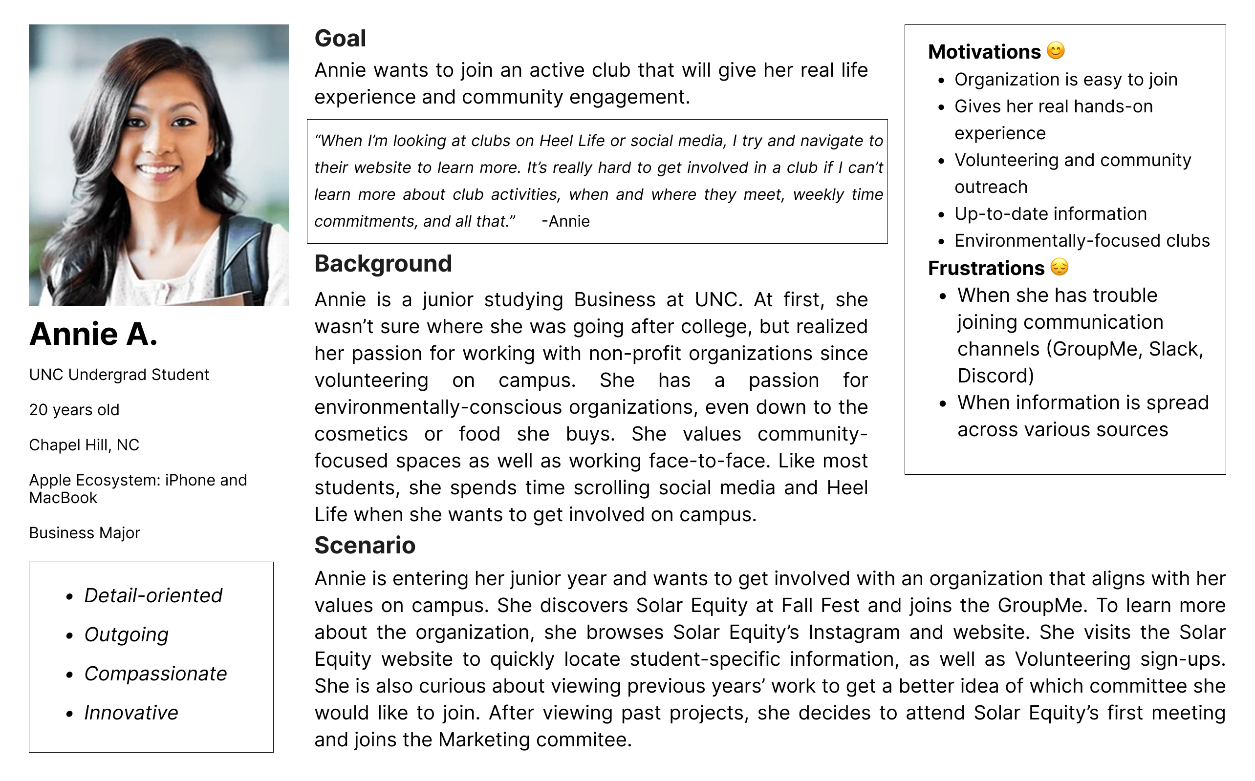
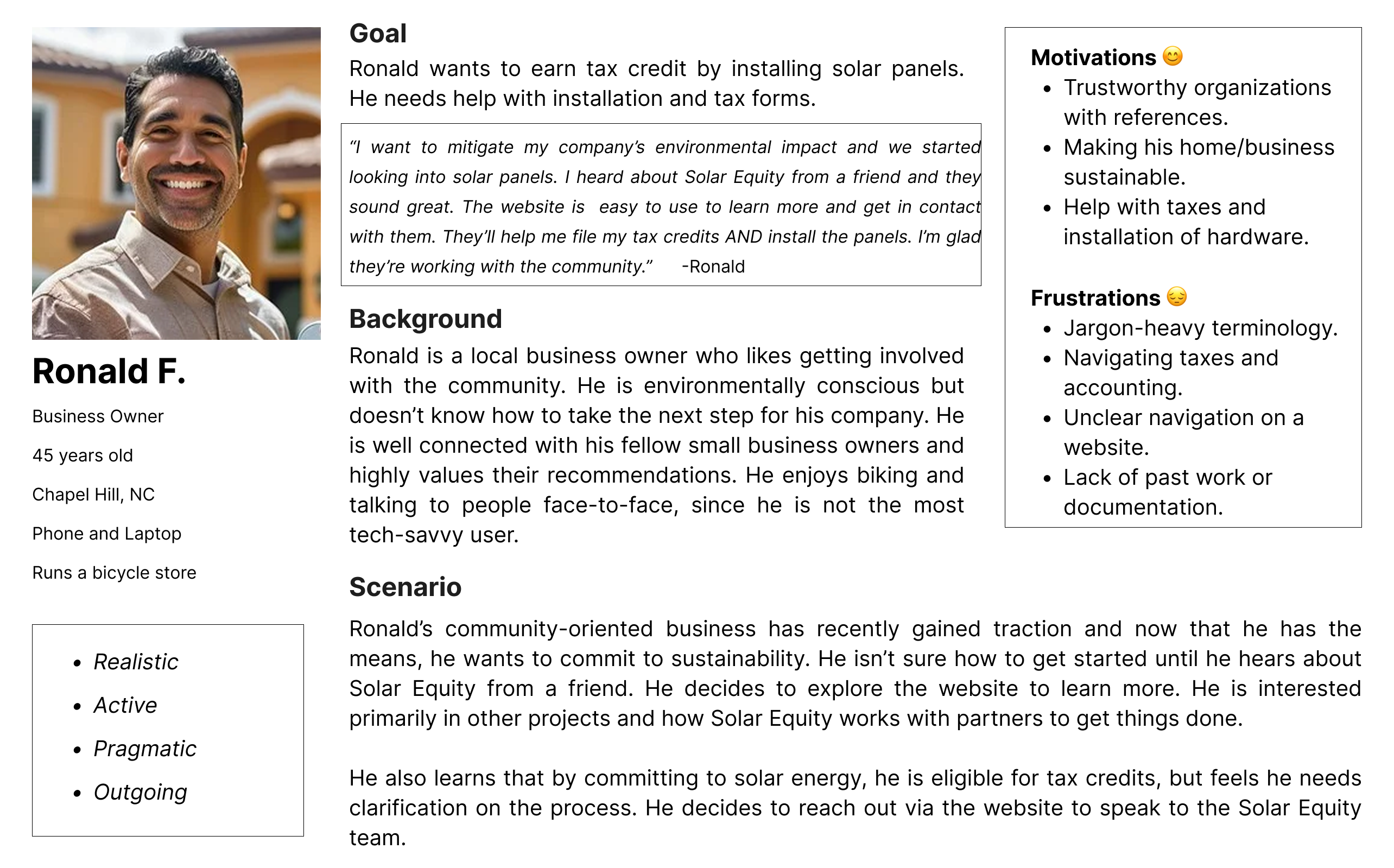
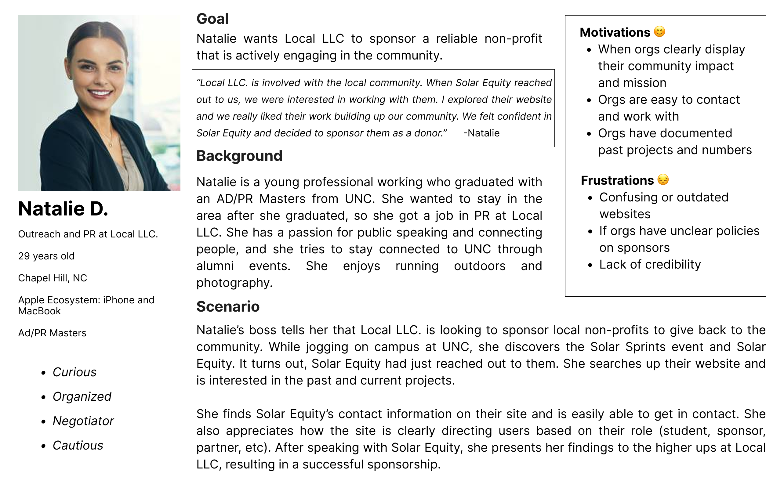
I conducted user interviews the Solar Equity board to get a better understanding of the club's audience and how they interact with different groups. Based on this work, I identified three distinct user groups based on this feedback.
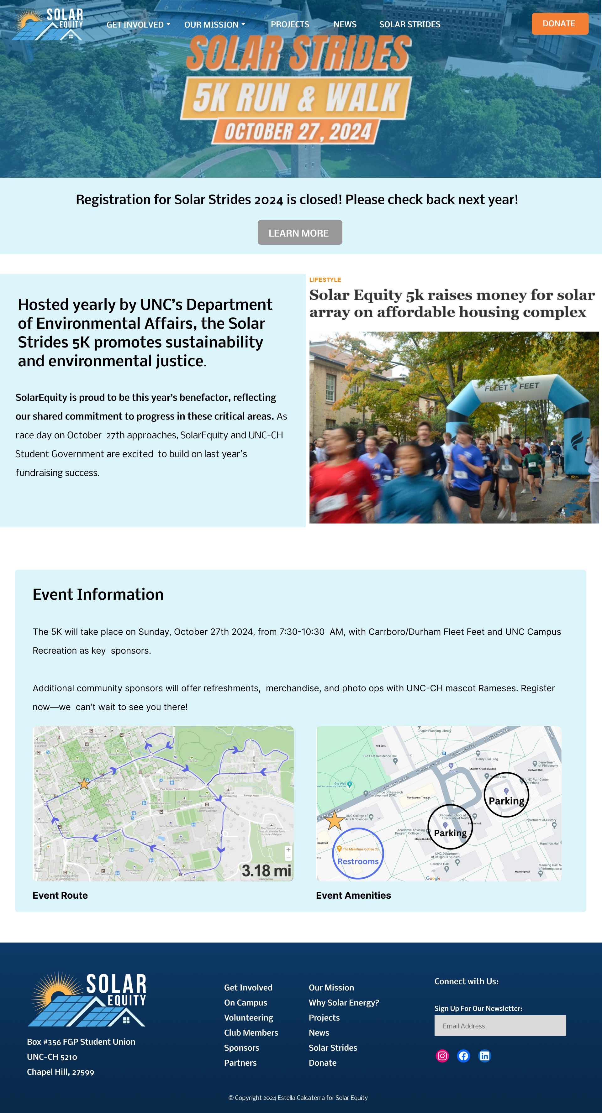
- Students: Students engage by volunteering or joining committees. Survey and interview data indicate primary interest in the organization’s mission, event information, student meetings, and Solar Strides (a sustainability-focused marathon).
- Sub-personas: Interviews identify three segments: (1) club members, (2) volunteer-only participants, and (3) event-focused participants (e.g., speaker series or marathon attendees). A user survey was conducted to determine the most valuable information for each segment
- Partners: Typically local businesses or organizations collaborating on solar panel installations, receiving tax and informational support. Interviews indicate primary interest in impact metrics, prior customer testimonials (credibility), tax guidance, and clear contact pathways.
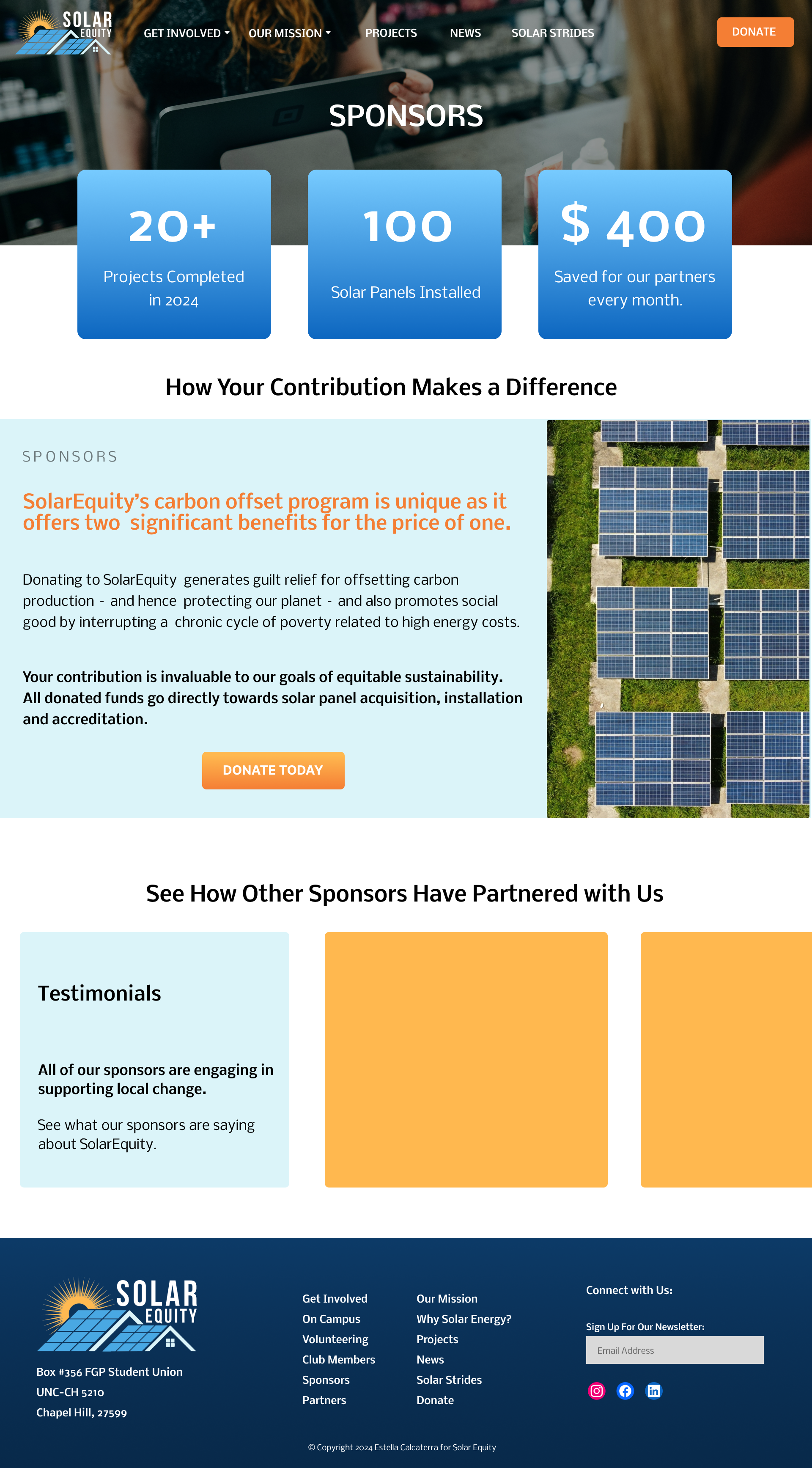
- Sponsors: Local businesses or organizations providing funding or solar panel donations. Similar to partners, they prioritize impact metrics, testimonials, tax information, and contact access; however, interviews emphasize a strong preference for a streamlined, secure donation flow.
 Student
 Partner
 Sponsor
Persona-driven User Flows
Different persona groups have different goals meaning its crucial to direct individuals to the correct location as early as possible from the landing page.
- Homepage: The landing page presents three primary pathways: Students, Partners, and Sponsors.
- Student Flow – User Story: “Annie is passionate about sustainability and community service and wants to volunteer with SE.”:
Students are directed to a decision page segmenting volunteers, members, and Speaker Series attendees. It guides selection while enabling cross-exploration. Survey data prioritized features aligned with student interests. - Partner Flow – User Story: “Ronald wants to install solar panels but is overwhelmed by costs and tax complexities.”:
The revised page adds logistical clarity, a contact form, and client testimonials. Interviews indicate partners prioritize peer validation, cost transparency, tax guidance, and clear next steps. - Sponsor Flow – User Story: “Natalie is tasked with identifying a sustainability-focused nonprofit partner.”:
A dedicated page was created highlighting impact metrics, tax information, and sponsor testimonials to establish credibility. Sponsors prioritize verified impact, financial transparency, and a streamlined engagement pathway. The homepage sponsor board reinforces community partnerships.
User Flow Example
Students may be interested in volunteering with Solar Equity. When visiting the site, they should have the opportunity to learn more and get involved.
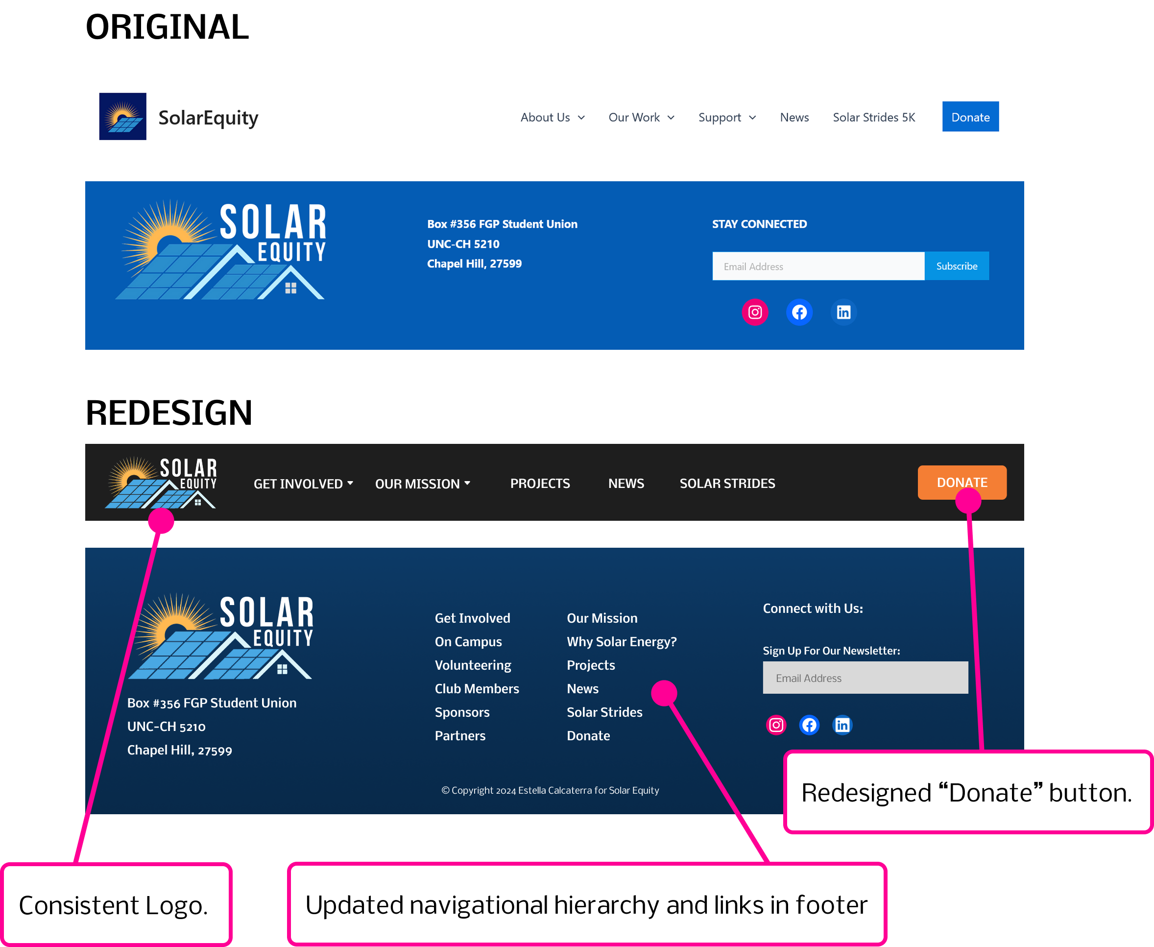
Clarifying Navigation
Based on persona-driven research, navigation was restructured around key flow anchors (e.g., Mission, Sponsors, Projects) using manual card sorting. Variations were user-tested. Next steps include expanded validation through additional testing.
The redesigned navigational structure also resulted in a redesign of the navigation bar and footer. I redesigned both with the updated design system and usability in mind.
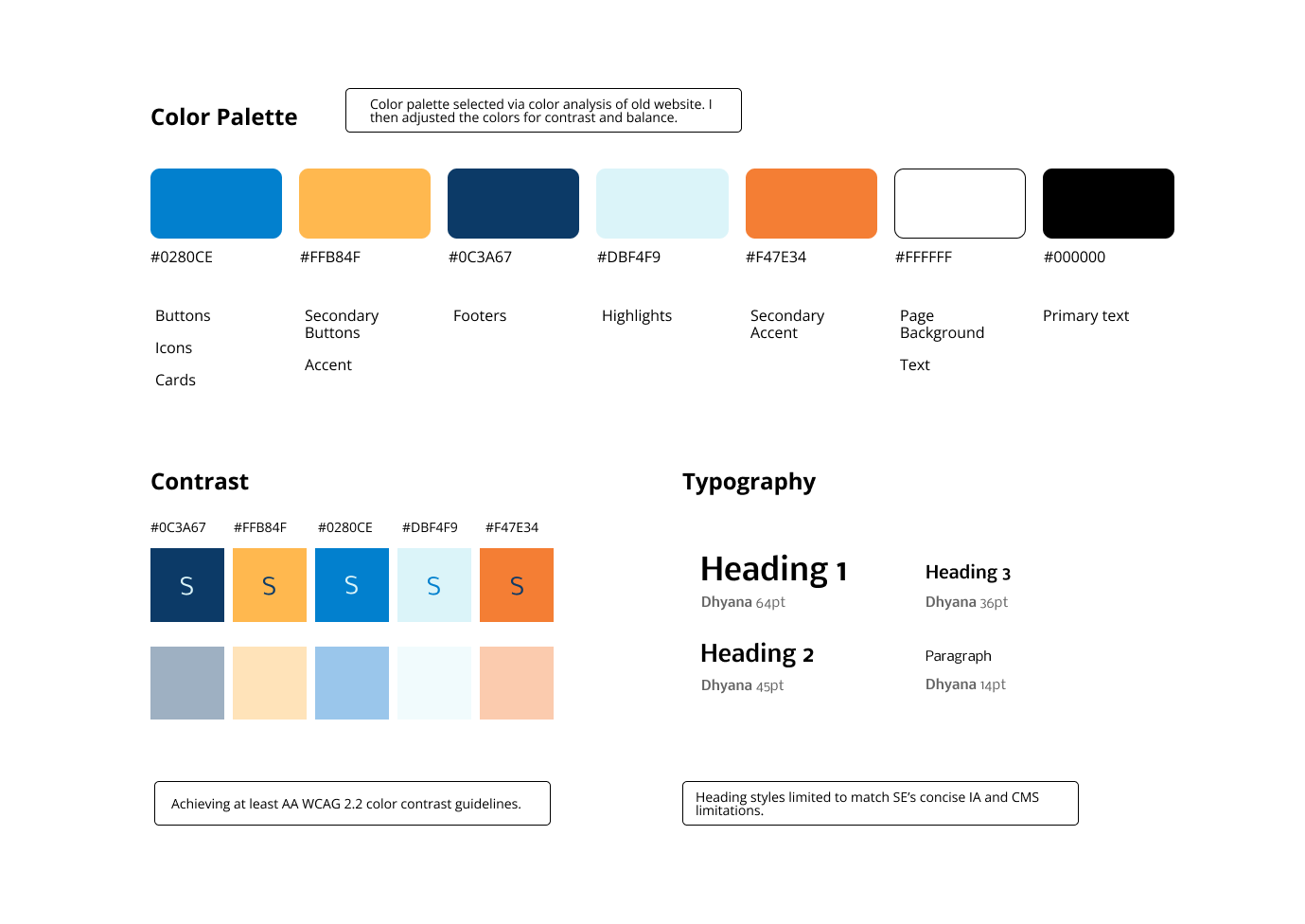
Design System
As a student-run organization without a development team, feasibility was constrained to standard CMS capabilities. The solution emphasized a scalable design system, modular layouts, and refined information architecture to ensure straightforward implementation without advanced programming.
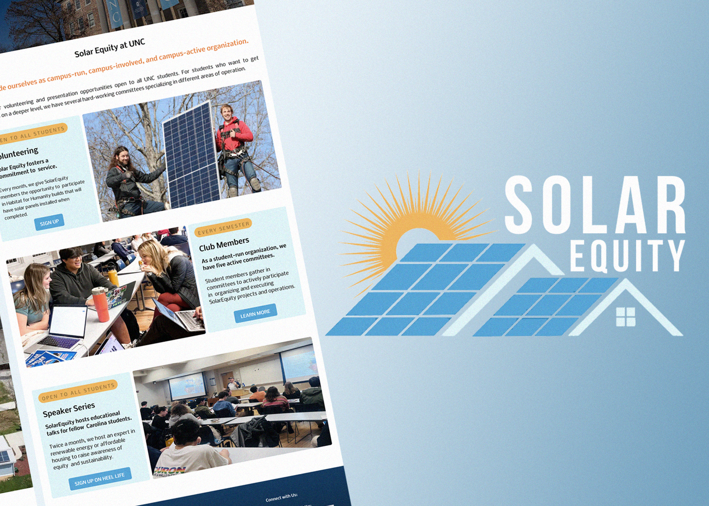
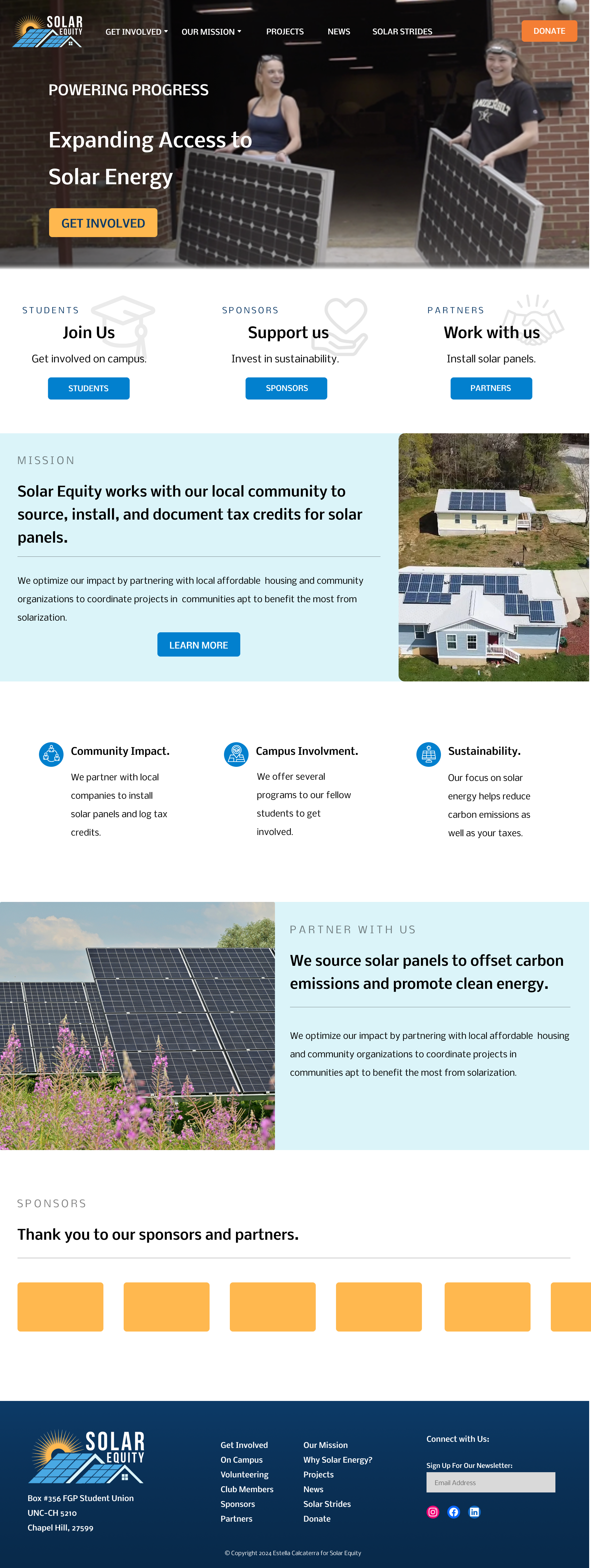
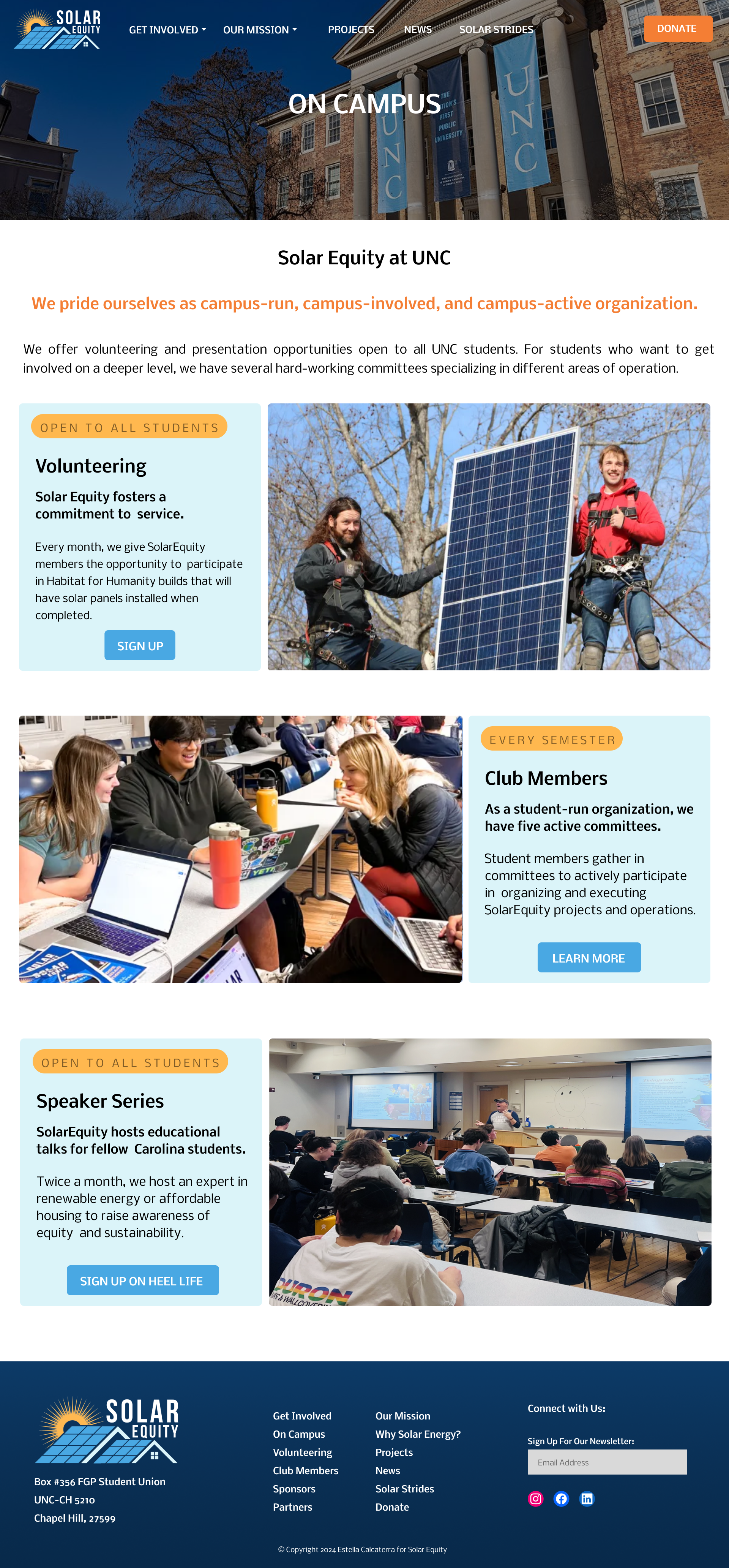
Prototype Highlights
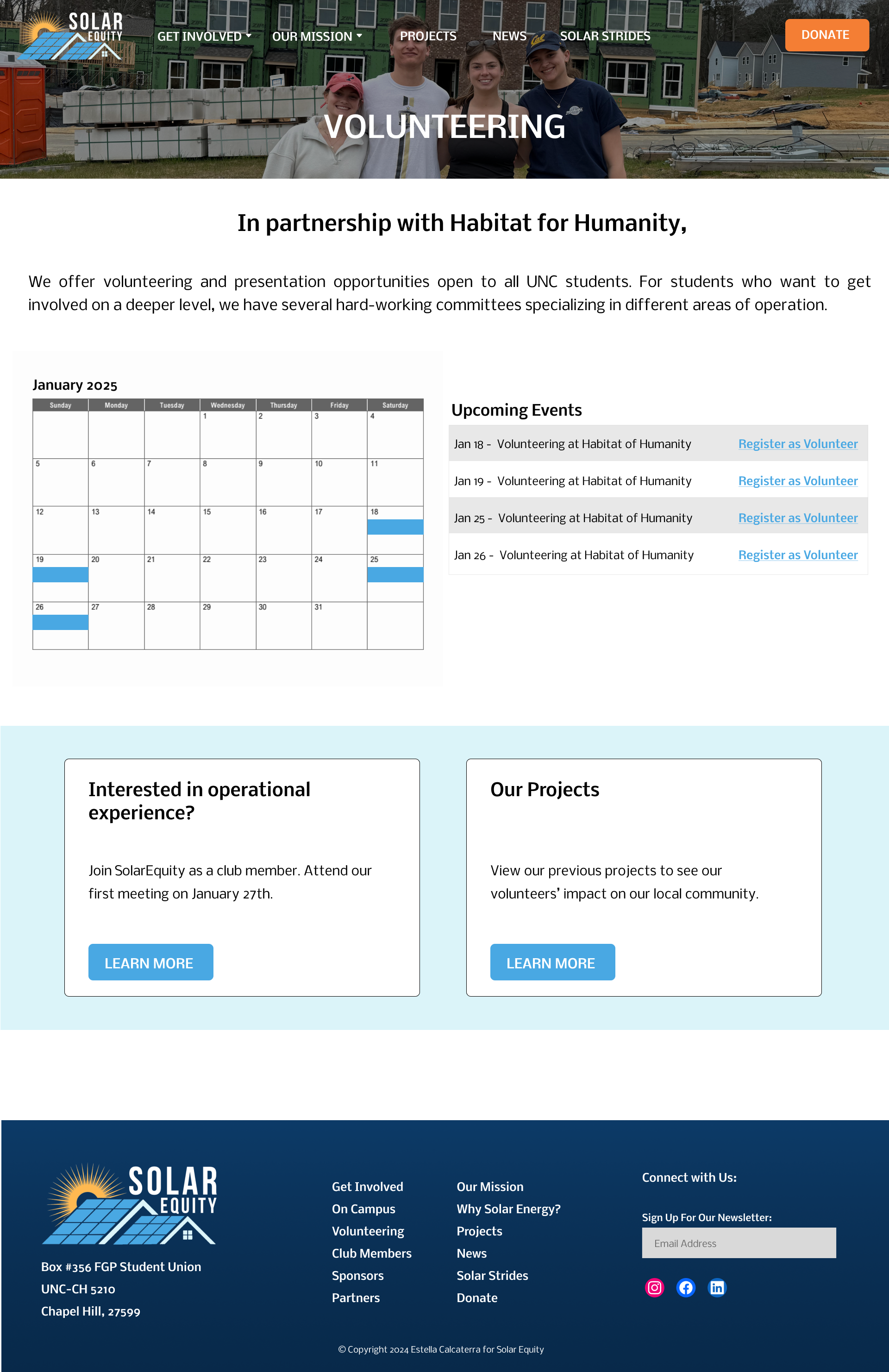
I developed a high-fidelity wireframe emphasizing updated navigation and persona-based flows (Note: not all pages are pictured).
- Modular Design: Content is structured into discrete sections using simple, repeatable components (e.g., cards, sliders).
- Image Headers: Activity images are integrated as header elements to contextualize content and strengthen user–organization connection.
- Interaction Design: Navigation and interactivity were systematically mapped to reinforce task completion.
- Calls to Action: Buttons, forms, and links drive engagement (e.g., interactive calendars, event lists, and registration pathways for volunteers).
Next Steps
This project reinforced the value of research-driven, persona-based design under real-world constraints. Limited direct client access required strategic interviewing and synthesis. Designing within CMS and resource limitations strengthened focus on scalable systems, modularity, and clear user flows.
- Conduct additional user testing across all primary personas (students, partners, sponsors).
- Validate and refine navigation through expanded card sorting and tree testing.
- Prototype and test the donation flow for security, clarity, and conversion.
- Gather quantitative feedback post-launch (engagement, drop-off, form completion).
- Develop implementation guidelines to ensure consistency within CMS constraints.