Streamlining information architecture and customer experience.
Role | Duration | Project Type | Tools/Skills |
---|---|---|---|
Project Lead | 4 Months | Partnership | Product Management, Figma, Surveys |
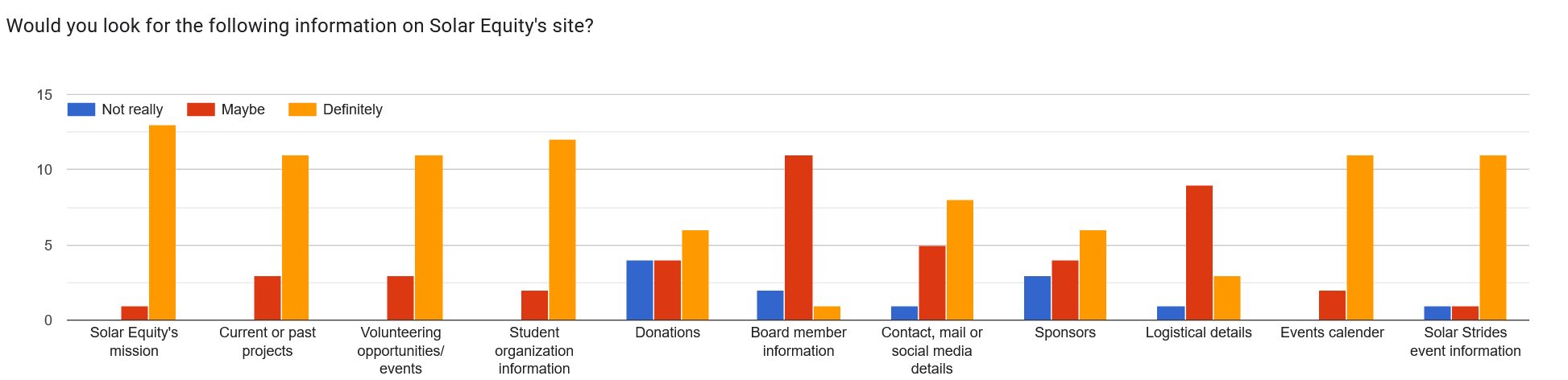
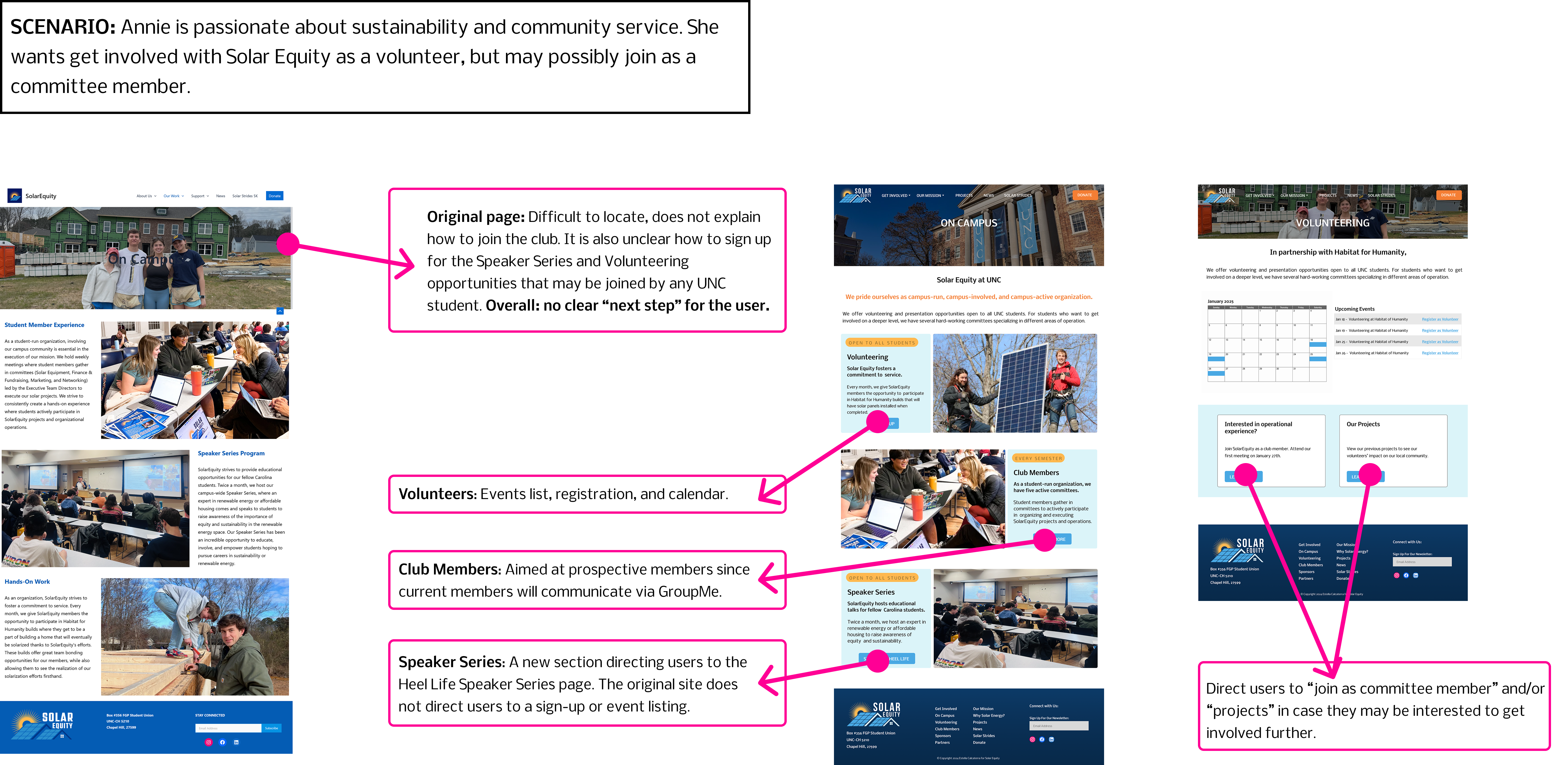
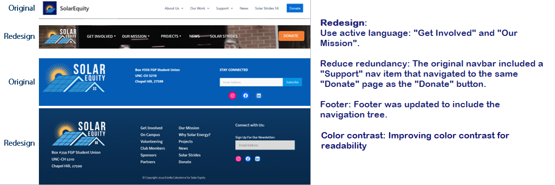
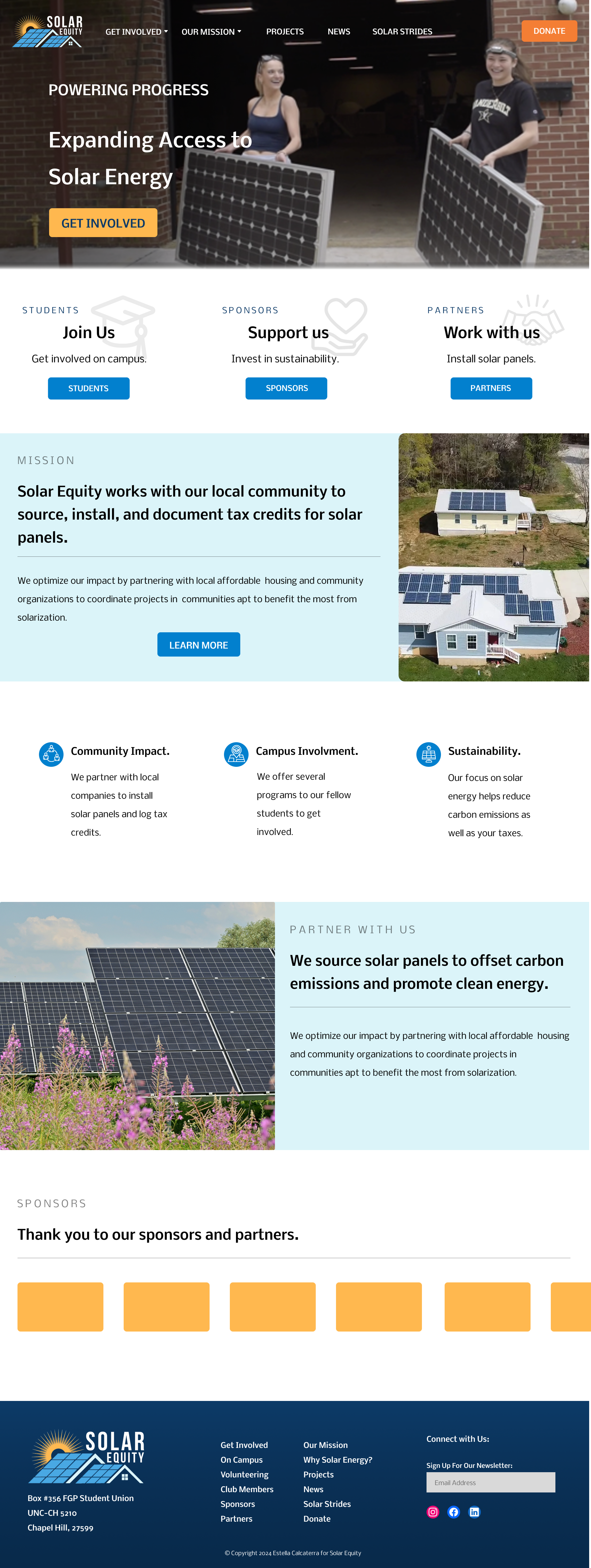
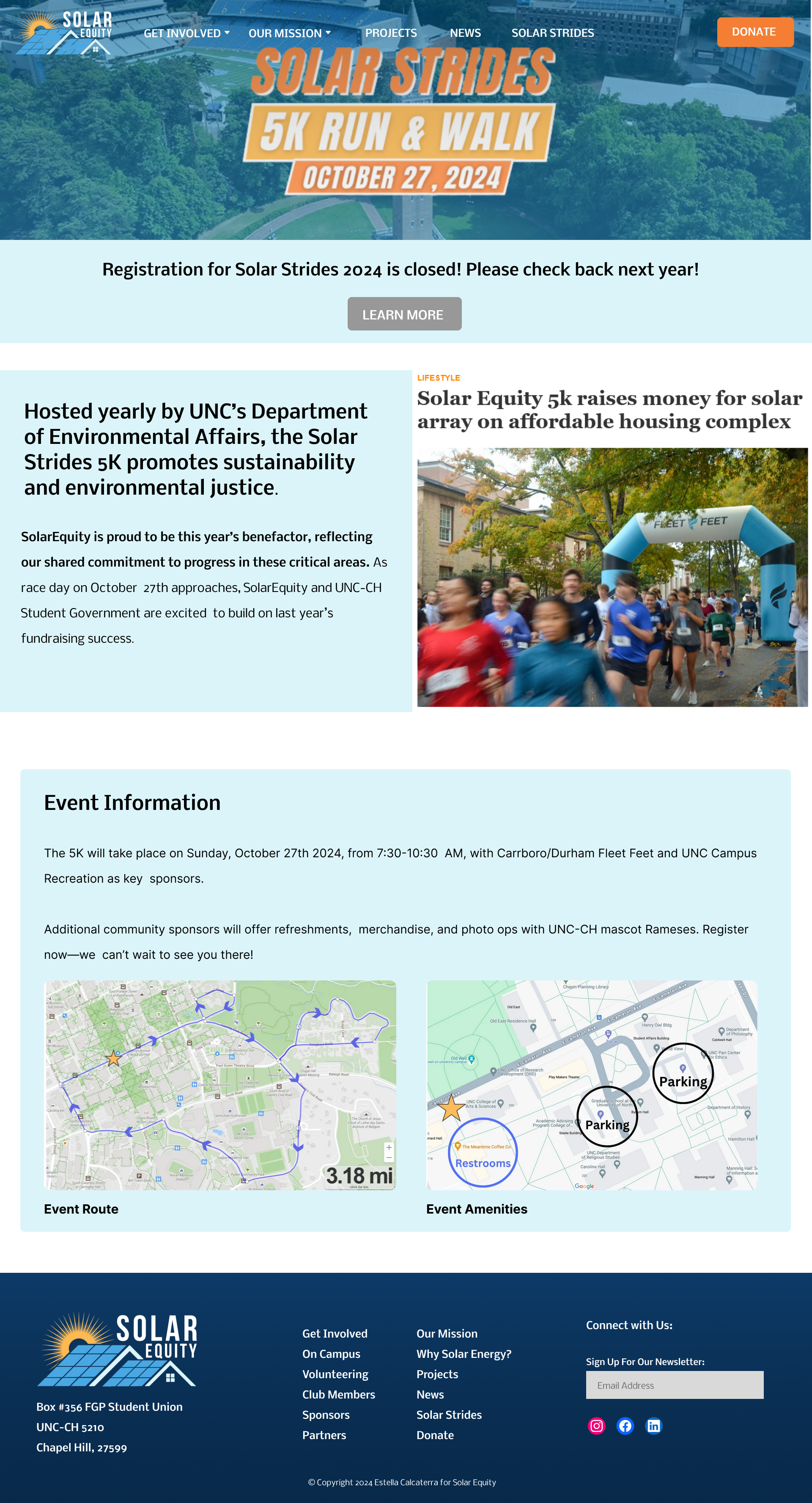
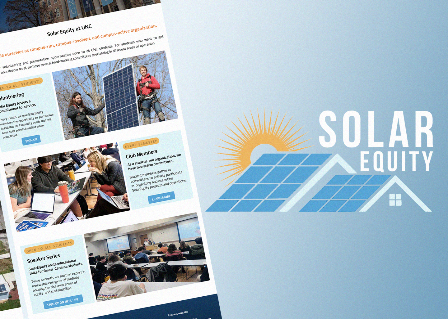
I worked with Solar Equity, a non-profit green-energy organization at UNC Chapel Hill. Solar Equity receives donated solar panels and works with local partners to install the solar panels and record them on tax data. Local sponsors also donate to Solar Equity to help fund their mission. Students either join as members or can simply volunteer their time. The club also runs events jointly with UNC like the "Solar Strides" marathon event.
Problem: Solar Equity's site had confusing and unclear information architecture, making it difficult to locate specific information regarding involvement or verifying the organization's validity.
Objective: Overhaul the Solar Equity web experience to inform users how to get involved as well as inspiring confidence in the organization.
Research and Process:
Outcome: A fully interactive prototype with updated data-driven information architecture shared with Solar Equity.
Positives | Pain Points | Next Steps |
---|---|---|
Clearly defined user segmentation and avenue of communication. | Unclear user flows for different groups of users, difficult to discover information. | Match website user flow to user personas and their needs. |
Strong community focus and use of images. | Lack of narrative or organized information. | Update information architecture to better structure site narrative. |
In partnership with Solar Equity, gave me through experience with UX research and design. Every decision I made was informed by user data or design thinking feedback.
The main purpose of the Solar Equity site is to inform potential participants on the organization and how to get involved.
User interview data helped me outline three main persona types.
Each persona has different goals, I prioritized directing users to the correct destination based on which information they are seeking.
In line with research-informed decisions surrounding persona-based workflows, the navigation needed to be upgraded. I outlined key points of user flow, such as
"mission", "sponsors", or "projects", and mapped pages according to a manual card sort. I tested variations of the navigation with a user test participant. Next steps
may include gathering additional data from user testers.
Referencing user research data and the original website design, I created a high-fidelity wireframe, highlighting updated site navigation, and focus on persona-based user flows.
Thank you to Solar Equity for collaborating with me on this project.