Header image depicting Solar Equity logo and a screen of the redesigned website.

Vanguard: Rebuilding a Financial Dashboard

Conducting a comprehensive study and redesign for Vanguard's Digital Advisor (AI Investor) Dashboard.

Role Duration Project Type Tools/Skills
UX Researcher and UI Designer 3 Months Partnership Domain and User Research, Figma, Cardsorting, Usertesting.com

Summary

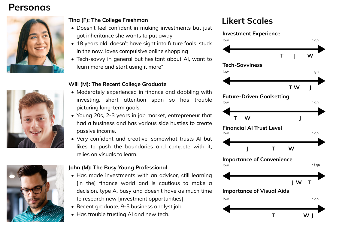
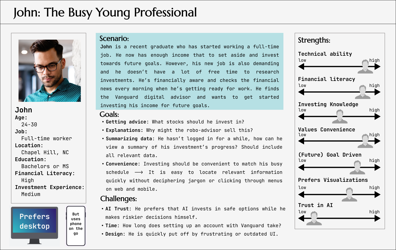
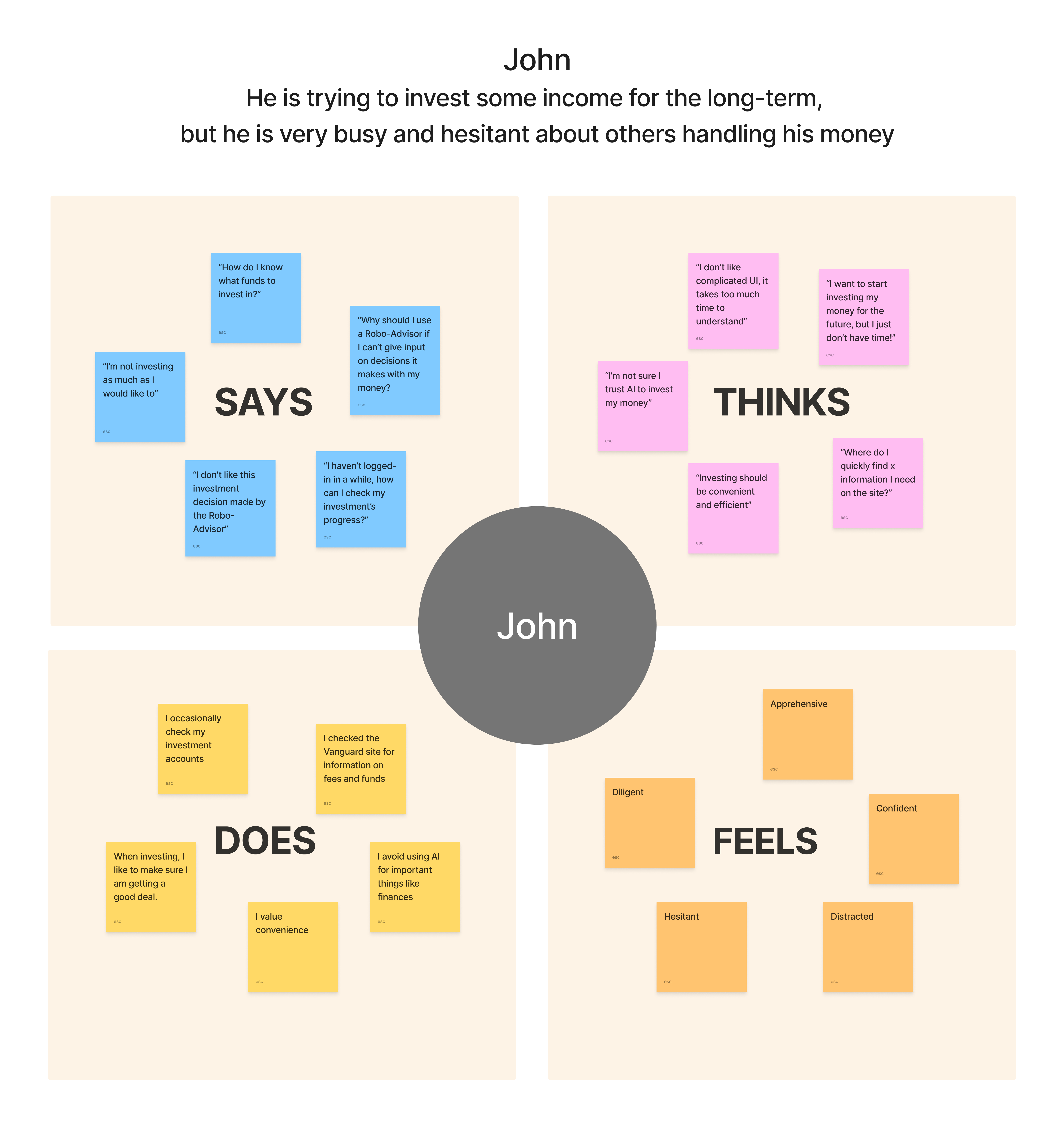
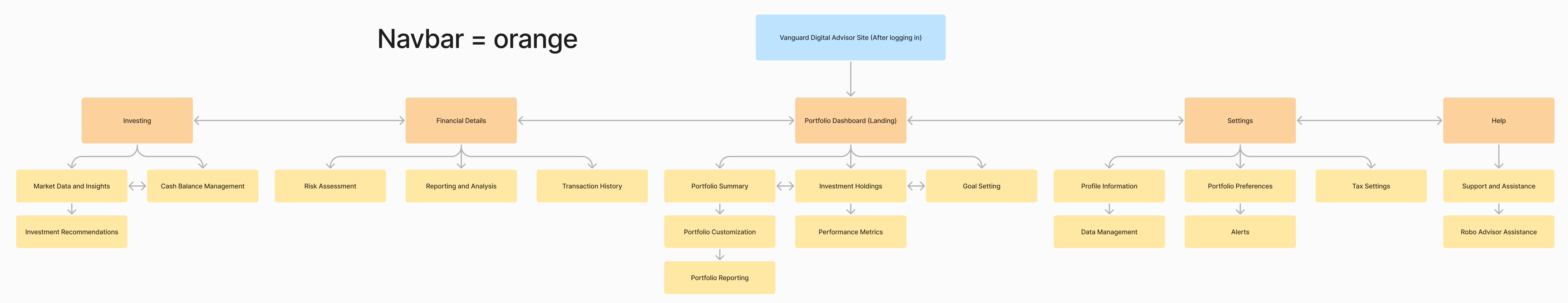
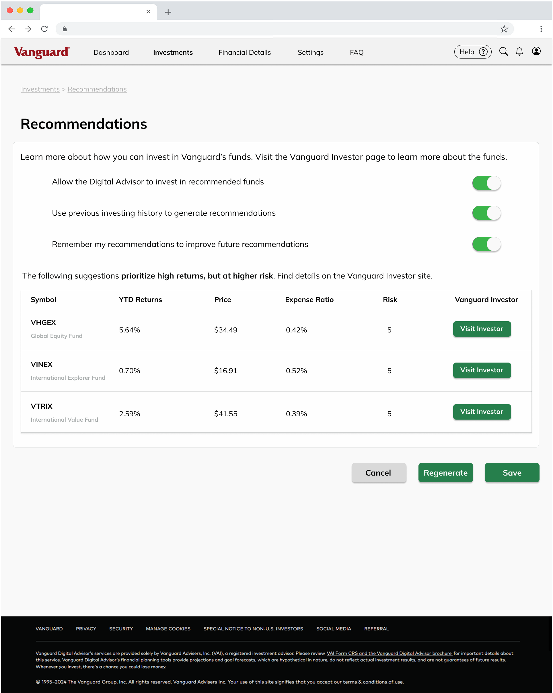
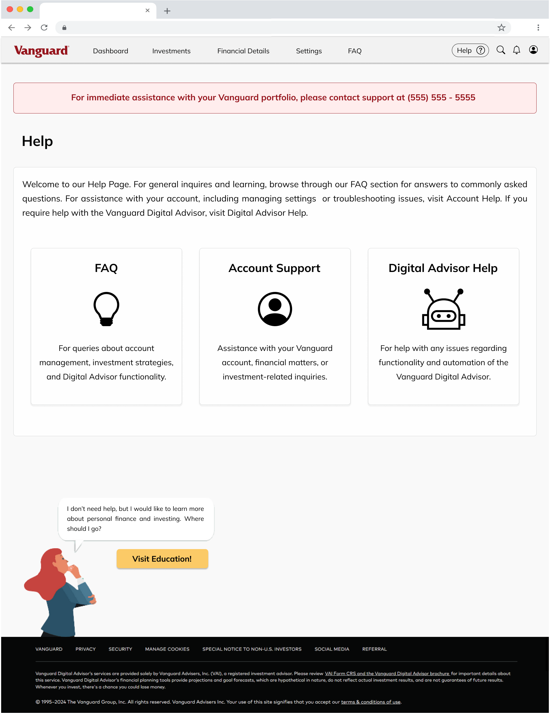
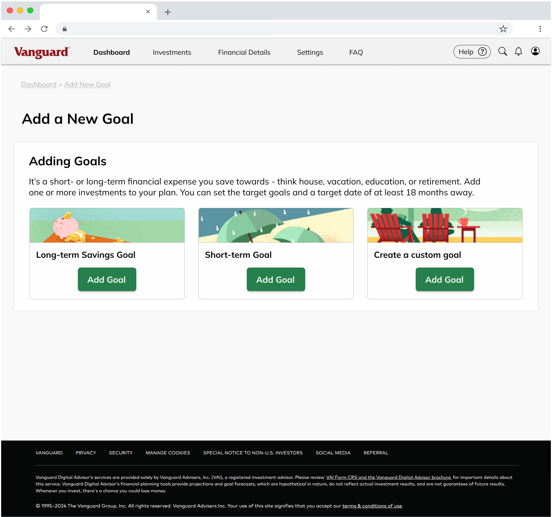
I was tasked with redesigning the Vanguard Digital Investor Dashboard, an AI-driven financial advisor, presented by Lead UX Researcher Steve Schang of Vanguard. Steve walked us through the initial wireframe, outlined the target demographics, and highlighted possible issues in the design. My goal was to create an intuitive, beginner-friendly, user-centered design to improve usability and product approachability.


Overview

Problem: Vanguard’s automated investing tool lacked an intuitive, user-centric dashboard, leading to confusion among both novice and experienced investors in navigating complex financial data.

Objective: Design a streamlined, intuitive dashboard that improves usability across all levels of financial literacy, enhancing user engagement and simplifying data-driven investment decisions. A strong user experience also meant a high likelihood of user adoption. We discovered through user interviews that easy to use and convenient products were most relevant to users sticking with a new product.

Research and Process:

  • Conducted heuristic evaluations to identify usability issues and design flaws.
  • Facilitated user interviews to gather qualitative insights into user behaviors and needs.
  • Developed personas to represent distinct user segments and guide design decisions.
  • Utilized card sorting to optimize information architecture and ensure logical content flow.
  • Iterated on wireframes and prototypes to test design hypotheses and refine the user experience.

Outcome: Delivered a high-fidelity interactive prototype with a user-centered dashboard, presented to Vanguard for further evaluation, addressing key pain points and aligning with business goals.


Reflection

This project, in partnership with Vanguard, gave me real-world experience in designing for financial technology. It involved a heavy emphasis on usability in particular due to financial regulations and rules.

  • Strengths of qualitative user testing: Informing design decisions with qualitative user data gave users the space to express their frustrations and issues in loosely structured user interviews. Through interviewing people, I picked up on several crucial points that I might not have gathered otherwise. For instance, many users expressed varying levels of hesitancy with finances and AI.

  • Mapping interaction design: Carefully mapping out interactive features allowed me to think more deeply about buttons, links, and other components and whether they added to the user experience. I referenced user flows I created to think through the most effective methods of clearly communicating an action. This is especially crucial in a financial setting, where all options and financial implications need to be understood by the user.


Initial Evaluation

To evaluate the initial prototype presented by Steve, I conducted a series of usability tests with users in the target audience. Overall, users reported three main areas of frustration or confusion.


Focus Positives Pain points Next Steps
Navigation: Difficulty locating features The overall layout of the dashboard itself was easy to navigate. Users could not locate key features like tax information in the navigation. Update site navigation to improve user flow to better locate key features.
UI: Visualizations Users enjoyed the use of visualizations in the dashboard. Users were overwhelmed by text and complicated charts. Provide more meaningful visualizations to quickly communicate account progress.
UI: Complex Financial Terminology Users thought marketing copy was insightful. Users struggled with understanding complex terminology. Simplify language and provide users with the tools they need to learn.

Personas

I gained a deeper understanding of the needs and potential areas of improvement for our target audience using multiple research methods ranging from qualitative user interviews, persona charts, likert charts and empathy maps to construct detailed user personas.

These insights helped inform the educational elements and straight-forward design that focused on deciphering complex language and visuals, making the platform more approachable for investors of all financial levels.

  • User listening sessions: Through qualitative user interviews, users freely expressed their experiences and frustrations with financial management. Users had differing levels of financial knowledge, trust in AI, and technological skill. I observed that in general, users were unclear on the role of AI and had difficulty understanding financial terminology creating a knowledge barrier between users and the Digital Advisor. To overcome this barrier, users suggested simplifying content or offering tooltip explanations.

  • Persona development: Via statistical analysis and persona mapping, I created segments to prioritize areas of focus. Segmentation of the target audience indicated that most users emphasized convenience and visual aids. Similarly, many users reported interest in automated investing but emphasized that they did not know how to get started or the time to learn.
Three personas are pictured, each with a description. There is also a set of likert scales ranking each user based on various categories.
A persona chart describing John the busy young professional, a scenario, goals, and challenges.
Empathy map describing what John the busy young professional might say, think, does, or feels.


Focus: Site Navigation

To address user concerns about locating features or pages, I conducted in-depth information architecture analysis of the existing structure to pinpoint problem areas. For instance, users typically had difficulty locating financial settings features such as tax reports or Digital Advisor investing strategies.

  • Card sort and tree map: I used a card sort to organize a more intuitive informational architecture. The card sorts revealed that users preferred features to be grouped under recognizable terms like "settings" instead of industry terms like "investor profile", and that features were typically grouped by function "recommendations" or "help" instead of by activity like "next steps" on the prototype.

  • Tree map outlining the site navigation.
  • User flow mapping: After restructuring the site, I walked through three crucial user flows to demonstrate how my updated informational architecture supported user actions. In particular I focused on help and locating tax settings since these were issues users had mentioned in user testing and interviews. I also piloted my recommendations feature: a feature that would allow users to further customize their investing journey and learn more about finance. Ideally, this service could encourage users to engage with investing and possibly open more traditional investing accounts with Vanguard as they gain more confidence in making investing decisions.

Three flowcharts depicting a user's journey through three different actions.


Focus: Design System and UI

When designing the user interface I emphasized the navigation and visualizations, both areas users reported as needing improvement. I did so by designing a component kit where I outlined a color palette and component library. Visualizations used were carefully chosen to clearly communicate different data users might be interested in viewing. In user interviews, I discovered that users wanted the dashboard to quickly communicate any changes since they had last signed in, which inspired an increased focus on implementing more meaningful visualizations.

  • Navigation bar: Based on card sort results, a new navbar was constructed to include straight-forward terminology and clearly group features within the reorganized categories. I also focused on highlighting specific features like the "help" button since this was a key issue mentioned in user testing.

  • Design System: I reconstructed the Vanguard design system through analysis of the prototypes and current Vanguard products. However I had to make several key decisions, such as limiting usage of the color red which typically has a negative meaning in investing. I also colored buttons green with clear calls to action to indicate "go" as opposed to the black buttons used in the prototype, which did not often as clearly indicate an action.

  • Visualizations: All visualizations included were intended to clearly display investment data and allocation. The original prototype used an exponential chart, which could not display additional data such as funds allocation or growth overtime on a smaller scale. Using information perception data and best practices, I determined the usage of line graphs (for metrics over TIME), bar graphs (clear communication of differing values over multiple variables compared at a common baseline), and a pie chart (showing percentages out of 100%) to be the most effective for communicating projected earnings, return per year, and overall funds allocation respectively. Graphs could ideally be personalized by users to display the data they were interested in.
Design system key including a guide to the color palette, font, logo, and visualizations.


Low Fidelity Prototype

Building off the rough idea of the user flow from the user flow charts I completed when reworking the information architecture, I first explored various interactions and page layouts. The low fidelity prototype was crucial for testing different user flow experiences. For instance, I learned that my original user flow for accessing "help" had too many pages and options. I narrowed this down to two pages, giving users the options to access different types of help (i.e., entering a ticket, talking with an AI chatbot) all on the same page instead of having a separate page for each.

  • Exploring page layout: I sketched several different iterations of the layout. Throughout my designs, I emphasized a simple, modular design to avoid distracting the user with an over-designed UI. This resulted leveraging whitespace and simple components to separate features and concentrate visual noise on the most important elements - like visualizations or settings.

  • Interaction design: I also mapped the interactions throughout the prototype through analysis of the user flow. For instance, all options or calls to action resulted in a certain pathway. Ideally, the interaction map helps developers understand the how the UI should interact with a user.
A collection of low-fidelity wireframe models.


Final Prototype

Via user research, information architecture restructuring, construction of a UI design system, and interaction design, I completed a high-fidelity fully interactive model and presented my project to my peers.

  • Dashboard: The dashboard is the main "landing" of the Digital Advisor portfolio. Users reported that when logging in, they expect the dashboard to quickly inform an summarize any changes in their investments. As discussed previously, I only included visualizations when they could provide additional, measurable information to the user. The dashboard pages allows users to view all transactions completed by the digital advisor (for AI transparency) and also allows users to view and modify their goals. The goals are a key feature of the digital advisor, so they needed to be easily viewed and accessible for any changes that needed to be made.

  • Recommendations: This feature was piloted by me. I noticed that the Digital Advisor had the opportunity to get users more involved in investing but did not currently allow users to personalize or customize their investments. The recommendations feature allows users to personalize their investing experience with the safety net of having all the investment options be safe or expert recommended selections. This way, a user can learn more about investing and possibly open an investing account with Vanguard. However, this feature should be tested and analyzed by financial experts prior to launch. Overall, all user feedback on this feature was positive!

Wireframe model of the dashboard showing growth overtime, monthly contributions, and more.
Wireframe model of the recommendations page highlighting potential investment options.
Wireframe model of the help page where users can select from several help options.
Wireframe model of the add goals page.


Updates and Next Steps

User testing on the final prototype resulted in a handful of minor updates as well as potential avenues of future improvement. I first addressed immediate concerns such as clarifying breadcrumb components and simplifying financial language, then I delved into possible next steps.

User Testing Feedback:
"If this was around when I was younger… I could definitely have used something like this. I would recommend this to anybody who's starting to save for some goals and wants to invest." - Test Participant #2

  • Overall, users responded positively to my wireframe: the layout, dashboard, and locating specific features. In particular, users enjoyed the simple navigation, UI, and my recommendations feature.
  • Areas of improvement: Further explanations on financial terminology and AI investing with the digital advisor, and improved visibility on certain links.

Completed Updates:

  • Navigation Aids: Upgraded "back" navigation links with improved visibility.
  • Descriptions: Added to existing descriptions to better explain certain features.
Summary of problems observed, recommendations, and my implemented changes.
Implemented updates including improved 'back' navigation links and improved descriptions.

Next steps:

  • AI Awareness: Some users expressed hesitancy with AI-driven investments, this could be addressed by providing further transparency or resources on AI.
  • Accessibility: Some updates to the color palette and text colors should be made to better meet accessibility color contrast standards.
  • Interaction States: Ideally, the design would implement Vanguard's existing design system. However, I would also include interaction states for each of the custom UI components I created.


Acknowledgements

A huge thank you to Steve Schang for introducing us to this project and my professor Dr. Laura Ruel for her guidance throughout! This project was a wonderful learning opportunity in product strategy, user research, and design.


Return Home